It’s easy to feel lost and anxious in a new environment. Even with the satellite-accurate quality of modern map apps in our back pockets, modern humans still get stressed when their internal map of the immediate area draws a blank.
While digital maps help us to find the fastest route through streets, when our need for direction is most urgent – such as finding the right department in a vast hospital campus, the relief of a toilet in a foreign airport, or the right platform 30 seconds before a train departs – even with innovative IPS technology, digital interfaces still come a distant second to well-placed signs or other, more intuitive, solutions.
All public locations involve an element of wayfinding, whether they appear to or not. But some present bigger challenges than others. For those environments where visitors are tasked simply with finding a specific item or location, such as car parks and seating plans, a simple alpha-numeric system will suffice. For those with additional layers of complexity, however – like transport hubs and hospitals – a more in-depth system might add color-coding to direct visitors without breaking their stride. For even bigger challenges where visitors are tasked with choosing their destination as well as finding out how to get there, such as libraries and shopping malls, information needs to be a little more detailed, yet still remain as simple and intuitive as possible. As these examples show, it’s not just about the size, the color, or even the design of the sign. It’s where you put it that counts.
Signposts: The Oldest Form of Wayfinding
Directions, whether from an app, a hard-form printed map, or an old-fashioned stopped person on the street, come in truncated stages that surround landmarks and decision points: ‘Turn left at…’, ‘Carry on until…’ The very best direction-givers provide travelers with information just before they start to wonder if they might have taken a wrong turn.

Signposts at the expansive Rachel de Queiroz Park in Fortaleza, Brazil, for example, command an unmissable presence in yellow against either the green, blue, or white of the background. Set at the park’s intersecting nodes, the signs are quick and easy to follow by featuring a recognizable symbol along with a destination name and arrow. The Maebashi branch of Shinonome Shinkin Bank in Japan, for example, uses the same combination of graphics with the height of a signpost to direct customers in its interior.
Examples of Signposts, Markers, Maps and Indexes in Public Environments:
Rachel de Queiroz Park / Architectus S/S

Shinonome Shinkin Bank in Maebashi / HAGISO + twism design studio

Station Forecourt Zwolle / PosadMaxwan

Agora Maximus, Tactical Urbanism Project / LAAB Collective + Signature Design Communication

Keep it Simple: The Golden Rule of Wayfinding Signage
When under pressure or in a rush, our comprehension and decision-making skills drop, and one of the biggest limiting factors to the comprehension of wayfinding signage is too much competition. Either by installing too many competing signs in one place or too much detail on one sign, clustered environments can be impossible to understand. With large, bold, and clear typography and the use of internationally-recognized numerics and symbols, signs need little-to-no intellect to follow, opening the door for all users no matter their nationality, age, ability, or concentration.

At the Kansas City International Airport, for example – an environment that needs wayfinding to suit a wide range of nationalities – large, clear, backlit gate numbers and restroom signs give the most important information priority, signaling travelers from a distance. At the University CEU San Pablo’s Polyclinic, meanwhile, alphanumerics and color-coding combine to navigate visitors through a maze of functional but identical booths.
Examples of Clear and Simple Wayfinding Signage:
Kansas City International Airport New Terminal / Skidmore, Owings & Merrill

Polyclinic of University CEU San Pablo / Adam Bresnick

Drusus Stadium in Bolzano / imp Architects

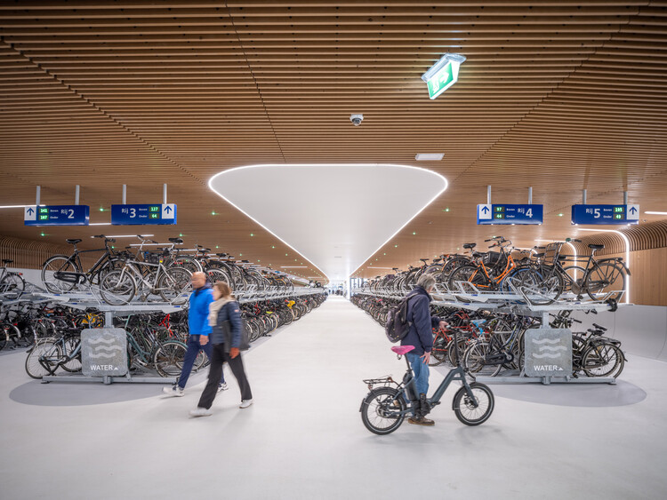
IJboulevard Underwater Bike Parking / VenhoevenCS

Using the International Language of Color For Directional Awareness and Recall
Color is a language that’s both intuitively and Internationally understood and recognized. Green is the color of affirmation. Used for safe-to-walk signage, emergency exits, and recycling refuse, it means yes, go, safety, fresh, and environmental. It’s clear, for example, without the use of text, that the green numbers at the IJboulevard Underwater Bike Park above relate to the changing number of free spaces in that row.

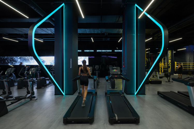
But using color to segregate different areas of any environment allows visitors to immediately recognize and recall what they’re looking for in future signage, too. Once the correct color has been identified, uncertain visitors only need to find the right color and an arrow. At the Kometa Black Fitness Club, for example, defined areas are slaves to their designated colors, with each restricted to a palette of their assigned hue plus black, helping members quickly find the right area in a vast world of fitness.
Examples of Environments Using Colour for Wayfinding:
Kometa Black Fitness Club / YoYo Bureau

Sports Centre in Leonberg / 4a Architekten

University of Southern Indiana, Screaming Eagles Arena / CannonDesign

Shanghai Subway Line 14 Yuyan Station / XING DESIGN

Floor Markings: Low-Level Directional Language
While the majority of wayfinding signage is positioned above our heads – making it easier to spot from a distance rather than through a crowd of people – for shorter people, lost children and those with an affinity to look down, the floor represents the only suitable surface for directional wayfinding and signage. Consider in smoke-filled emergencies, for example, where low-level emergency lighting leads crouching escapees to the nearest exit, while standard signage at above-head height remains hidden behind a thick wall of smoke.

With less time to read and recognize signs in the immediate vicinity while walking, however, floor signage is restricted to only the most simple graphic typologies such as arrows and lines. The GRiD, for example, is a retail experience targeted at young people in Singapore. In the mall, floor paint leads consumers with arrows and dotted lines, through the space toward toilets and emergency exits, while also sparking enough creative individualism to resonate with the intended youth market.
Examples of Ground-Level Wayfinding:
GRiD / SPARK

Magma Flow Public Space / 100 Architects

One Green Mile / MVRDV

Xianfeng Community Renovation / Atelier cnS + GZUPDS

Raised Pathways Remove Street-Level Distraction
As a city-dweller, I find underground transport systems all over the world extremely simple to use. The combination of a few simple wayfinding cues such as colored lines, straight-line routes and paths only leading to the platform or street, makes them extremely intuitive and mean that, no matter which country I’m in or which language is spoken, I can find my way to exactly where I want to be without needing to stop.

When pedestrians are removed from the clustered distractions present on a city’s sidewalks, it’s far easier to direct them. Raised walkways like the Sewoonsangga Citywalk in South Korea keep blinkered pedestrians on the right path by putting them in an information vacuum. Just like an underground transport system, the 1.2km-long separated pathway runs above, below and at ground level, at various points connecting to the street with ingress and egress points for pedestrians to ‘board’ or ‘alight’ the route.
Examples of Raised Paths and Walkways:
Sewoonsangga Re-Structuring Citywalk / modo studio

Dongan Lake Sports Park Landscape Corridor / Atelier sq

Vanke Community A1-B2 and Bus Station / UV Architecture /Huayi Design

Longgang Core Area Overpasses Design / FCHA

Find these selected projects with Wayfinding in this ArchDaily folder created by the author.


